


Prototype
Prototypes make the designs come to life. They should feel real and respond in the expected or intended ways. The prototype stage helps to find flaws with the experience or communicate exactly what is expected. It's also the best way to test out the app designs with user testing.

App Rationale
Name:
True Food
Mission Statement:
To connect people with healthy food options, spreading the power of real food and inspiring healthier communities.
How the idea manifested & intentions:
this idea manifested by the lack of healthy options I found on DoorDash, etc. The app is meant to communicate with the person striving to eat a healthier diet, but is a busy working professional and has limited time to cook at home. It’s for those who, toward the end of the week, may run low on groceries and energy and be ready to order out. This app will clarify your options based on what’s available in your area, and screens which restaurants are able to participate. It is intended to connect the discerning health-conscious diner with restaurants that cater to healthier diets.
Values and promises:
Values are whole/non-processed, organic, free range, grass-fed, farm to table, sprouted, vegetarian, vegan, juice, raw, gluten-free, paleo, and keto diets. Animals raised humanely. Restaurants will list the primary ingredients of each menu item, list possible allergens and highlight on menus what is organic, dairy free, etc. Restaurants will offer customization. To strive for using recycled materials and be plastic and Styrofoam free. No man-made oils, or otherwise they must be listed. Food transparency—being clear and honest about sourcing, ingredients, nutrition, environmental footprints, and social impacts.

Competitor Analysis
It is important to find similar companies that match your product. An idea or business won’t stand a chance if there is a better product or service out there. So to prevent a flop, I had to seek out the competition and make myself stand out.


User Stories
I wrote these user stories to determine a scope of work for development build out as well as
defining what the users’ goals are and how I would incorporate those goals into my designs.
As user who works overtime, I want to pick up my dinner on the way home from work, so that it’s fresh and hot.
As users on a retirement income and not tech savvy, we want the process to be very simple and to pick our food up at curbside. So that it’s hot, we can make sure the order is correct before paying, and we don’t have to tip.
As a user, I want food delivered, so that I can stay at home while the baby is napping.
As two users who work and have a family, we want an economy value meal delivered on Fridays, so that we can relax at the end of our work week.
As a user in his 50s who is a busy realtor with high income who will use this app frequently, I want points to earn bonus meals.
As a user who studies late and gets hungry late, I want to know right away which places are open, so that I don’t place an order with a restaurant that is closed for the night.
As a user on a limited budget, I want to be able to track my expenses for eating out in one place, so that I can factor this into my food expenses.
As a user that lives in a home that GPS’s tend to get confused finding, we want assurance that the driver will make sure to find us, so that we will get an instant refund and notification if the food doesn’t get delivered.

Target Audience
Here I identify that target audience in order to please them and keep them coming back. This audience was then used to create personas, the most loyal customers (fictional).
Gender: 50% male, 50% female
Age: 63% of people are 18-29 (who have used a multi-restaurant delivery website or app in the past 90 days), followed by 51% for those 30 to 44 years old
Careers/Income: Low income. The younger the person and the lower the incomes have the highest usage: 51% for those earning less than $10k per year. So I’m going to say students, retail workers, and people in the service industry.
Life Styles: people who love to hang out with friends, party, go out, extroverts, active, inconsistent schedules, and/or lots of studying
Value drivers: hip design factor, superior brand, great customer service, well-trained drivers, accurate delivery time, wide selection of restaurants, dependable drivers, quality fresh/hot food, healthy food, pricing
Habits: people who do not cook, grocery shop, do food prep or meal plan

User Flows
User flows were created as a road map to show how users will navigate through the app. More importantly to show other team members how users get from one screen to the next.


User Interviews
User interviews were completed to force me to step out of my own head and allow someone else outside of the project to weigh in. I found users based on my target audience and created a script of simple questions.
Takeaways:
Users do like and want healthier, more ethnic, diverse cuisine, and favor local.
They also want to be able to customize or ask for certain dietary needs.
Due to the pandemic, they have used takeout or delivery more than ever. They all face time constraints and busy schedules, which are barriers to cooking homemade.
They do have to watch the food budget, but none were motivated by a rewards system.


Wireframes & Mockups
I planned out the layout of the screen to screen in order to get a feel for the users’ interactions and experience in my sketchbook. This also sets up understanding from team members. With such small real estate, it requires more attention to detail on micro interactions. Wireframes allow easy creation without wasting time on screens that may be altered or removed.
Mockups were then created in order to get final buy-in from stakeholders and development. They inform the team what is to be expected for the final project. Utilizing all my research—brand summary pieces, accessibility grid, and my design system components—I created working mockup files.

Design System

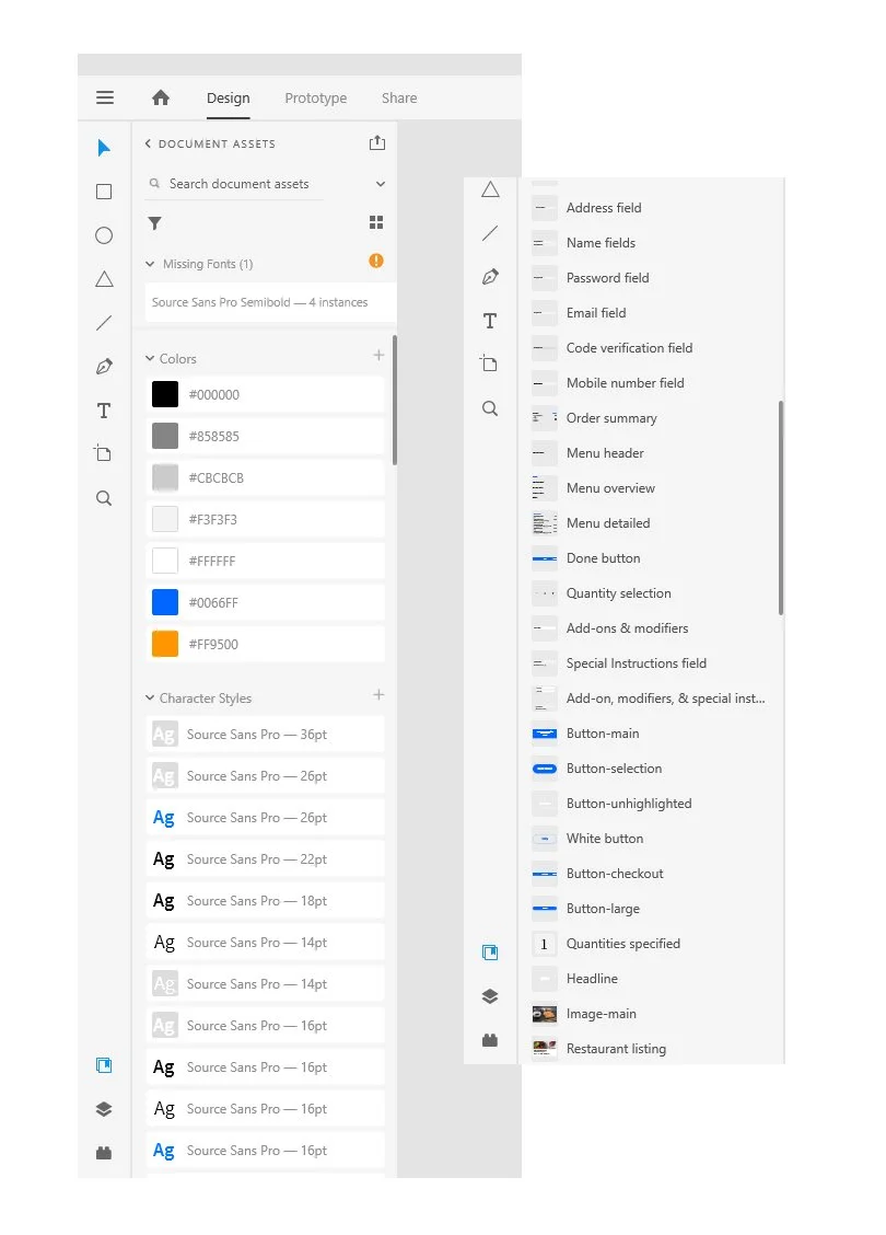
Utilizing the Assets panel in Adobe Xd, I created a robust asset library to rely on within my document for mockups. Design assets were created for:
colors
type styles
common components
- buttons
- bottom navigation
- top navigation
- lists
- text fields
- other groups of repeatable elements
different component states
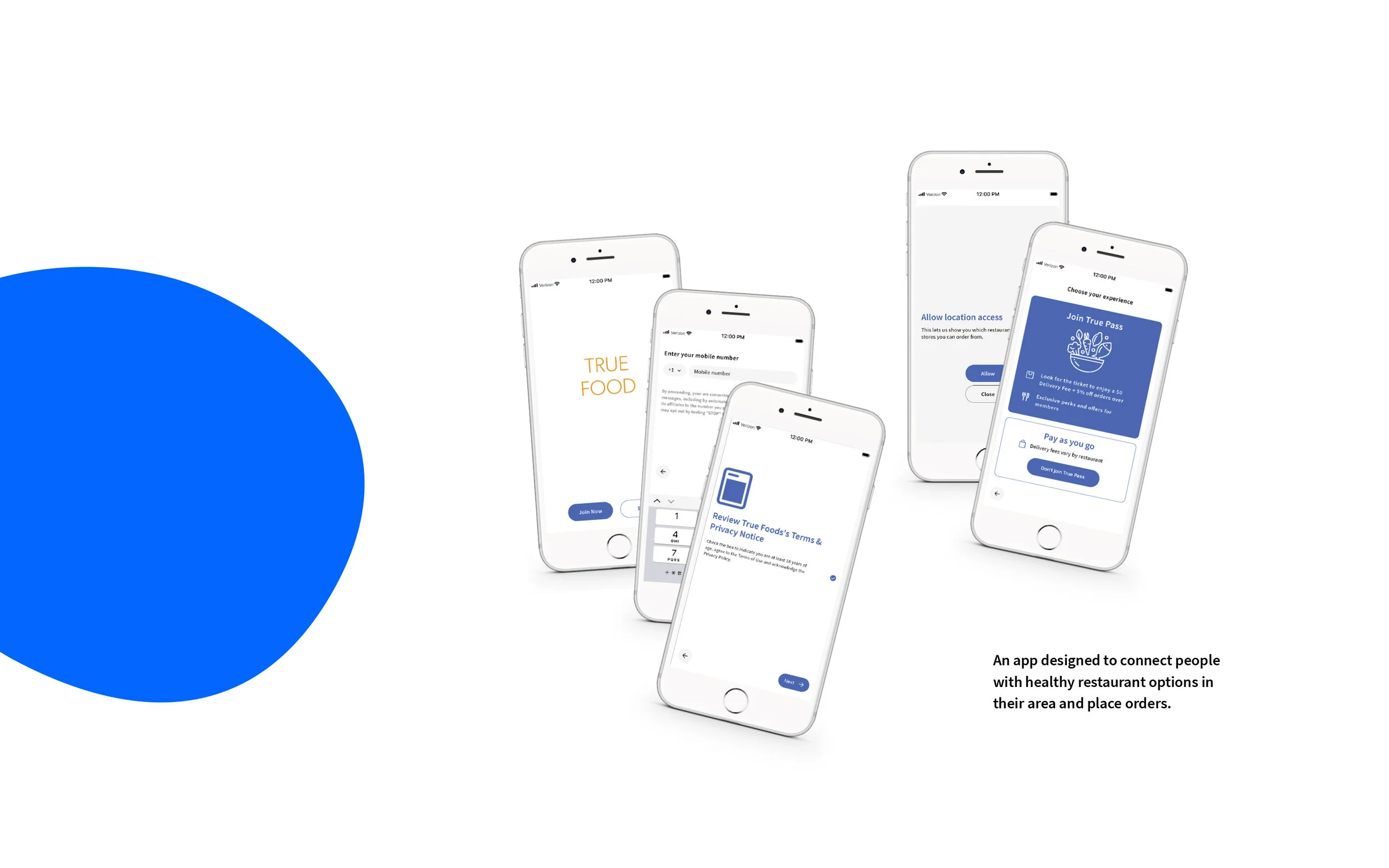
Onboarding


